At our core, we believe that great design isn’t just about looking good, but it’s all about communication, clarity, and impact. As designers, we often hear phrases like “make it pop” or “add some creativity,” but the truth is, there’s a method behind the magic.
Mastering the principles of graphic design helps you create flawless designs efficiently, saving time while improving your work. These are the building blocks that guide us in creating designs that not only catch the eye but also tell a story and serve a purpose.
They help us make choices, whether it’s about color, typography, spacing, or layout that feel intentional and cohesive. They remind us that every design decision has an impact on the viewer’s experience. And they act as a roadmap, keeping us focused when we’re juggling creativity with strategy.
In this blog, we’re breaking down 15 essential design principles in simple, easy-to-understand terms. These guidelines will help you design more intelligently rather than more difficulty, regardless of your level of experience.Let’s dive in!
What Are the Principles of Graphic Design?
As we’ve seen, the principles of graphic design serve as guidelines or rules that help you create the best possible version of your design, making your ideas clearer and more effective. They guide how to arrange and combine different elements like text, images, colors, textures and shapes so that the final design feels intentional and easy to understand. Think of these principles as the invisible threads that hold a design together.
A design could appear disorganized, unclear, or even overwhelming without them. However, when we adhere to these guidelines, our designs become more effective, engaging, and transparent. They assist us in producing work that stands out from the crowd, interacts with the audience, and delivers the intended message.
From balance and contrast to structure and white space, each concept has a distinct purpose. In the next section, we’ll cover 15 essential design concepts that even beginner designers can start using right away!
15 Design Principles of Graphic Design You Need to Know
There’s no magic wand in graphic design but understanding the design principles of graphic design is pretty close. These principles give us a framework to create visuals that aren’t just pretty but purposeful.
Below, we’ve broken down 15 essential design principles in simple terms, so you can start applying them to your own projects whether it’s a poster, a social media post, or a brand logo.
1. Balance – Keeping Things Steady
Balance is about distributing visual weight so a design feels stable. It can be symmetrical (mirrored) or asymmetrical (more dynamic). Viewers can concentrate on the appropriate components without feeling overloaded when there is good balance.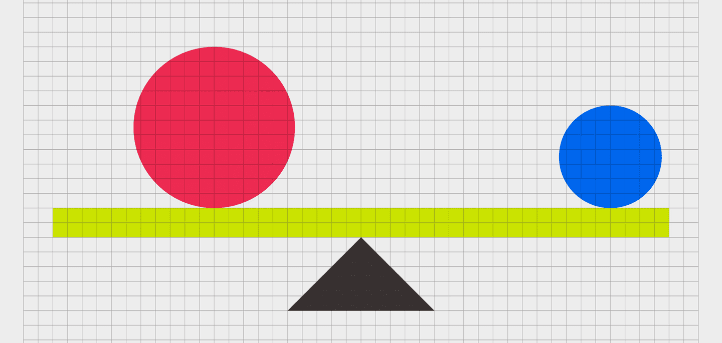
2. Contrast – Bringing Elements to Life
Contrast is what makes important elements stand out. It could be color, size, shape, or font. A higher contrast makes it simpler to focus the viewer’s attention and draw attention to the most crucial details.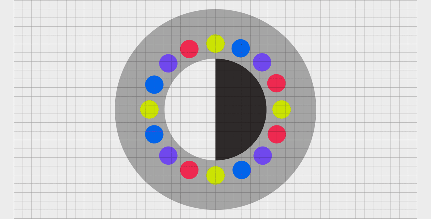
3. Alignment – Lining Things Up
Alignment brings order to chaos. Therefore, by lining up text, images, or shapes, you create a sense of connection and flow. It enhances your design’s readability, professionalism, and organization.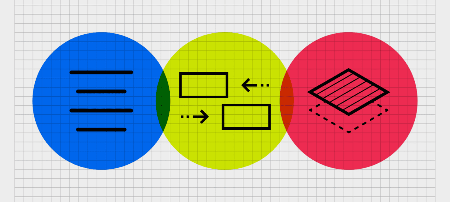
4. Hierarchy – Guiding the Viewer’s Eye
Hierarchy helps organize content by importance. Bigger, bolder elements usually come first, while smaller details follow. It’s like giving your design a roadmap that leads the viewer’s attention step by step.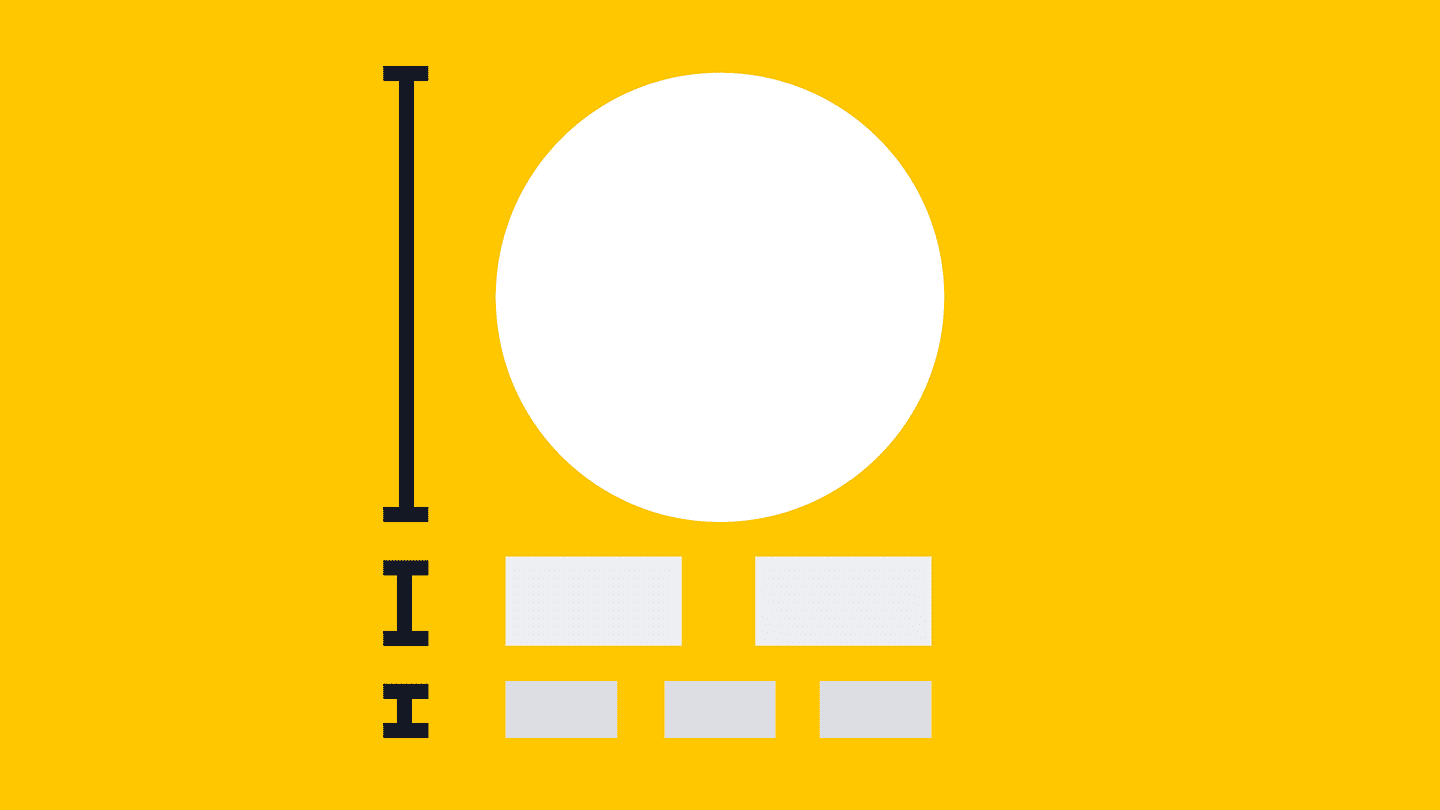
5. Repetition – Creating Consistency
Repetition builds familiarity and strengthens branding. Whether it’s colors, fonts, or shapes, repeating elements creates a rhythm that helps tie your design together.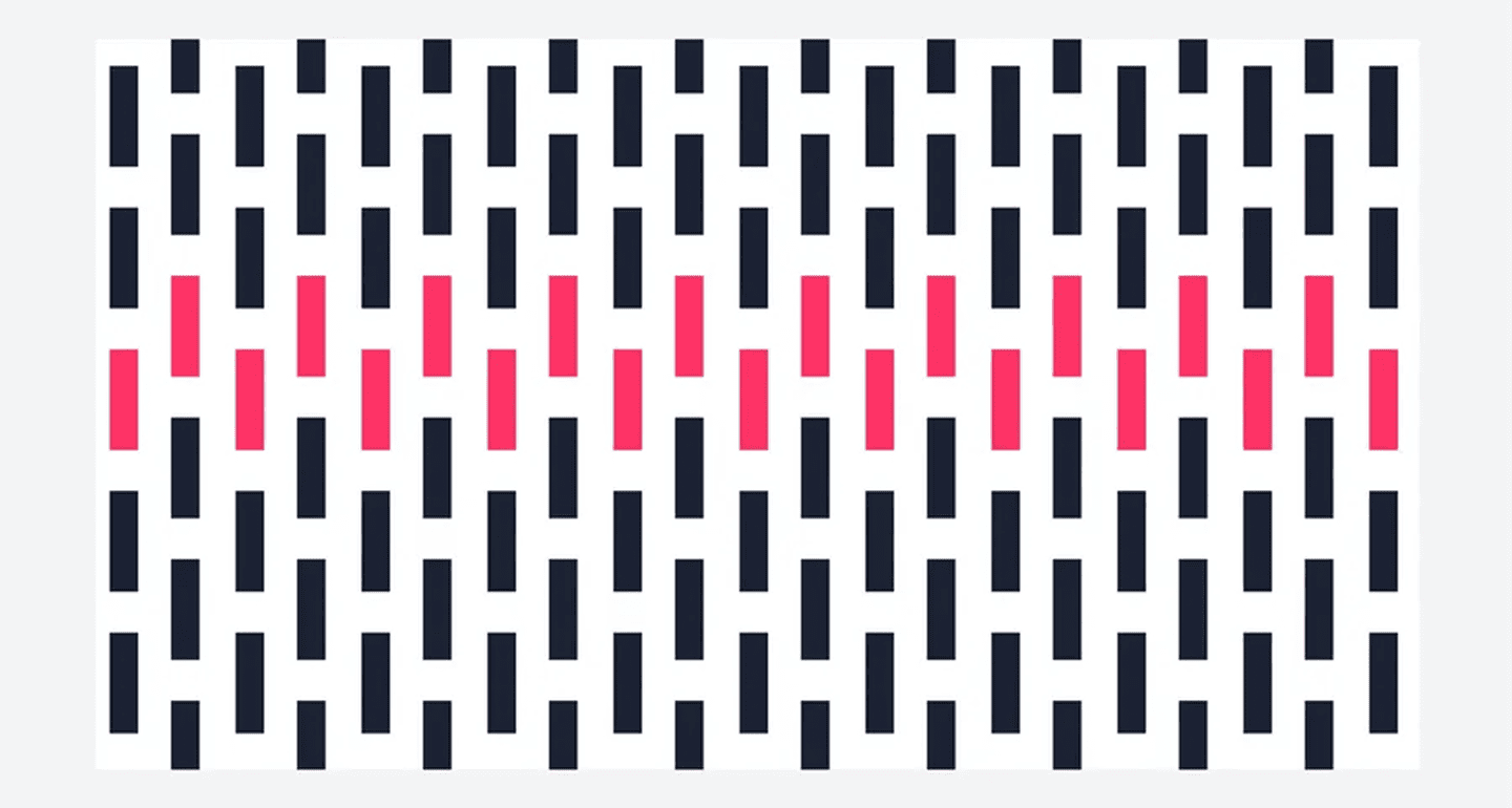
6. Proximity – Grouping Related Elements
Proximity means placing related items close together. This creates a visual connection and helps viewers understand how different parts of your design relate to each other.
7. White Space – Letting Designs Breathe
White space, or negative space, isn’t “empty” space, it’s a powerful tool. It gives your design breathing room, improves readability, and draws attention to important elements.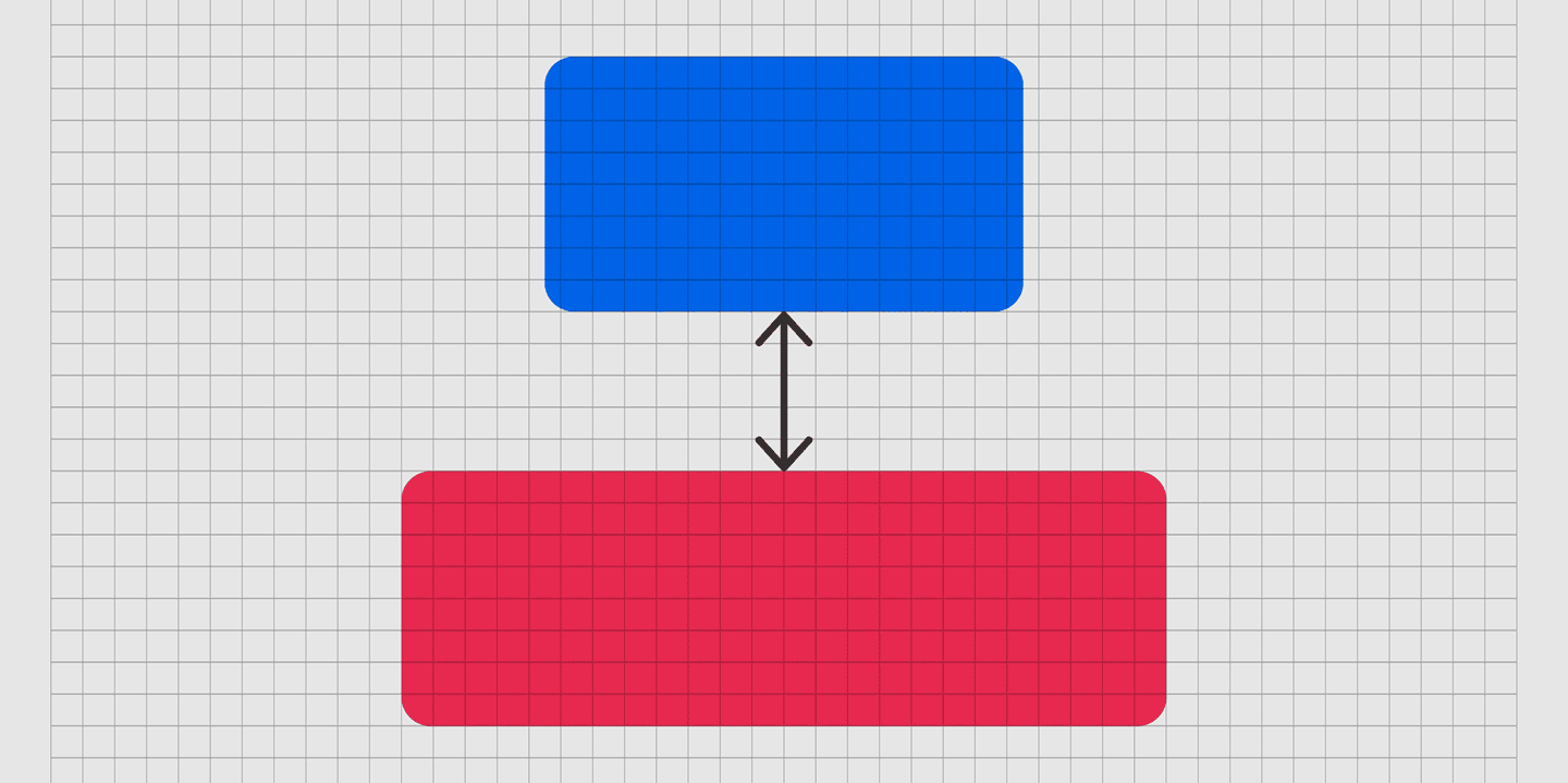
8. Typography – Making Words Speak Visually
Typography is more than just picking a font. It’s about font size, spacing, alignment, and style all working together to enhance your message and ensure readability.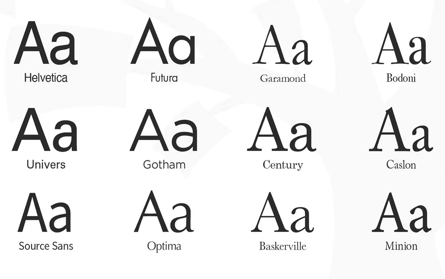
9. Color – Setting the Mood
Color sets the tone for your design. Muted tones feel more subdued, but vibrant colors draw the eye. Choosing the right color palette can evoke emotions and reinforce your brand identity.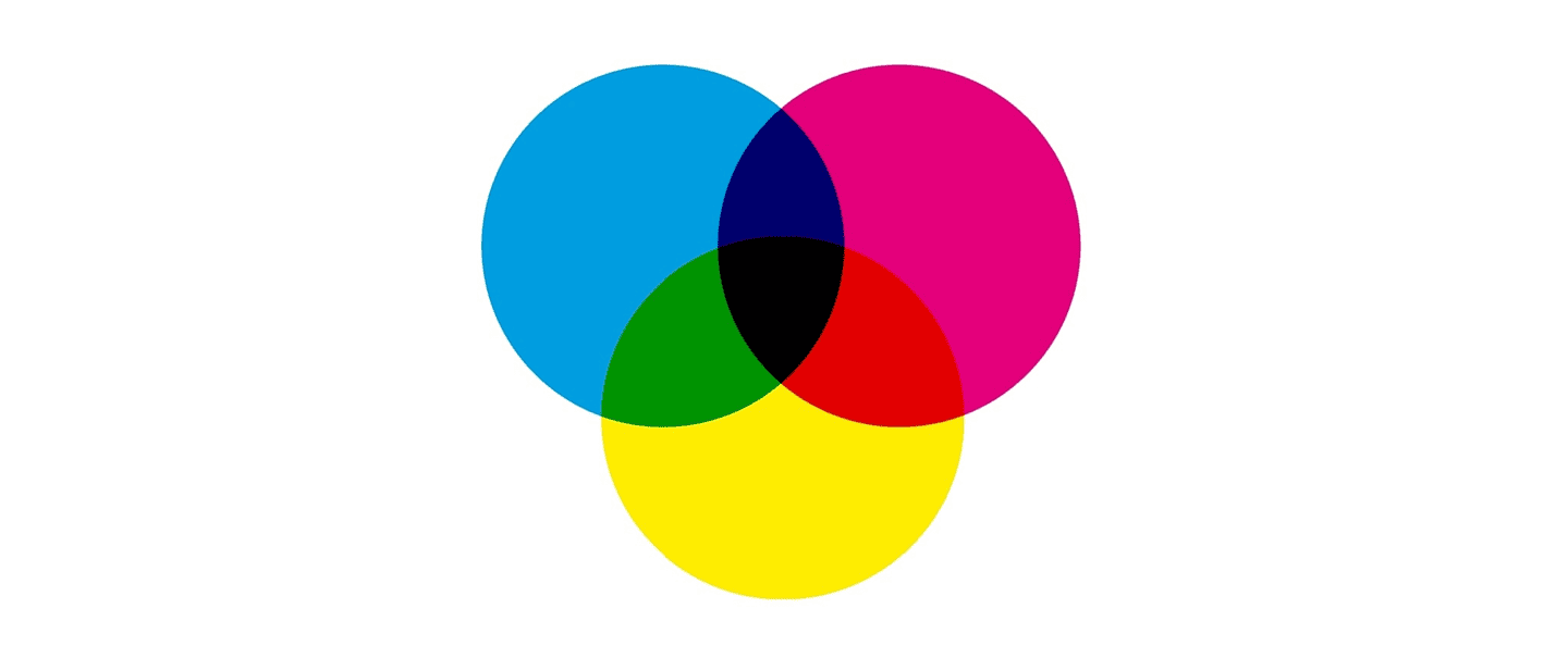
10. Scale – Playing with Sizes
By altering the size of pieces, scale contributes to the creation of visual interest. Bigger items usually feel more important, while smaller ones support them. It’s an easy method to add depth and attention.
11. Movement – Creating Flow and Direction
Movement isn’t about animations, it’s about guiding the eye across a design. Lines, shapes, and patterns can lead viewers from one part of the design to another, telling a story along the way.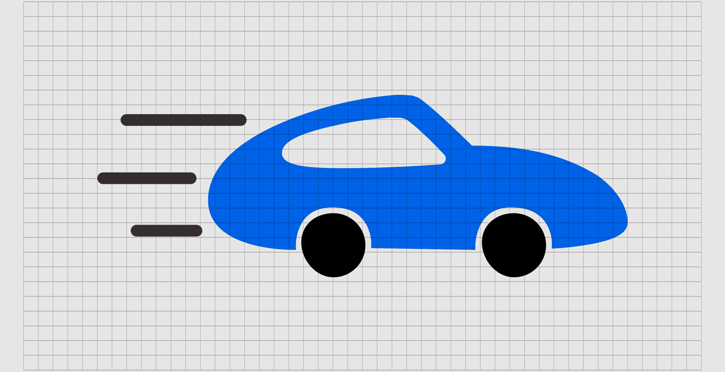
12. Unity – Making Everything Belong Together
Unity means all the parts of your design feel connected, like they’re part of the same story. It’s achieved by using consistent colors, fonts, and styles that tie the elements together.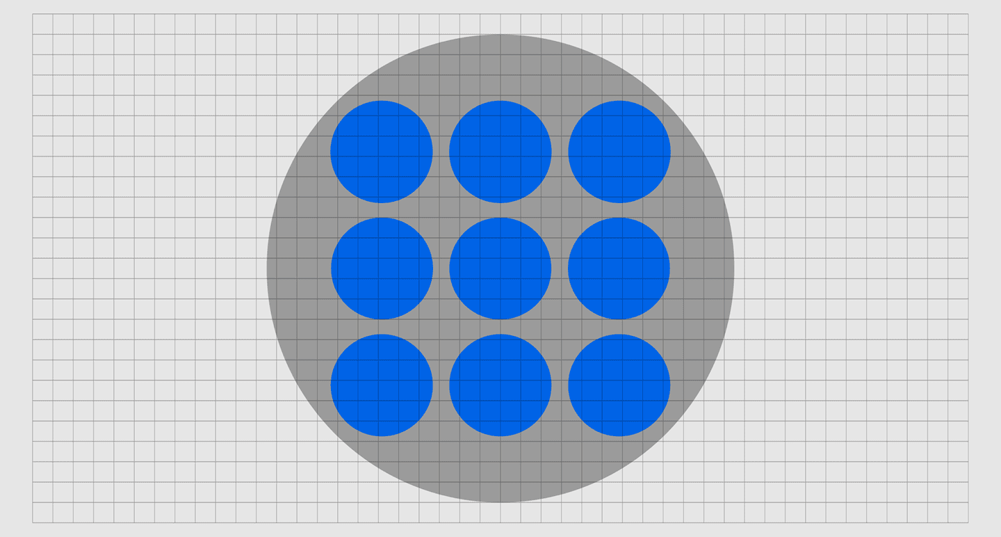
13. Variety – Adding Interest Without Chaos
Variety keeps designs exciting by mixing different elements colors, shapes, textures but in a way that still feels balanced and unified. It prevents a design from feeling boring or repetitive.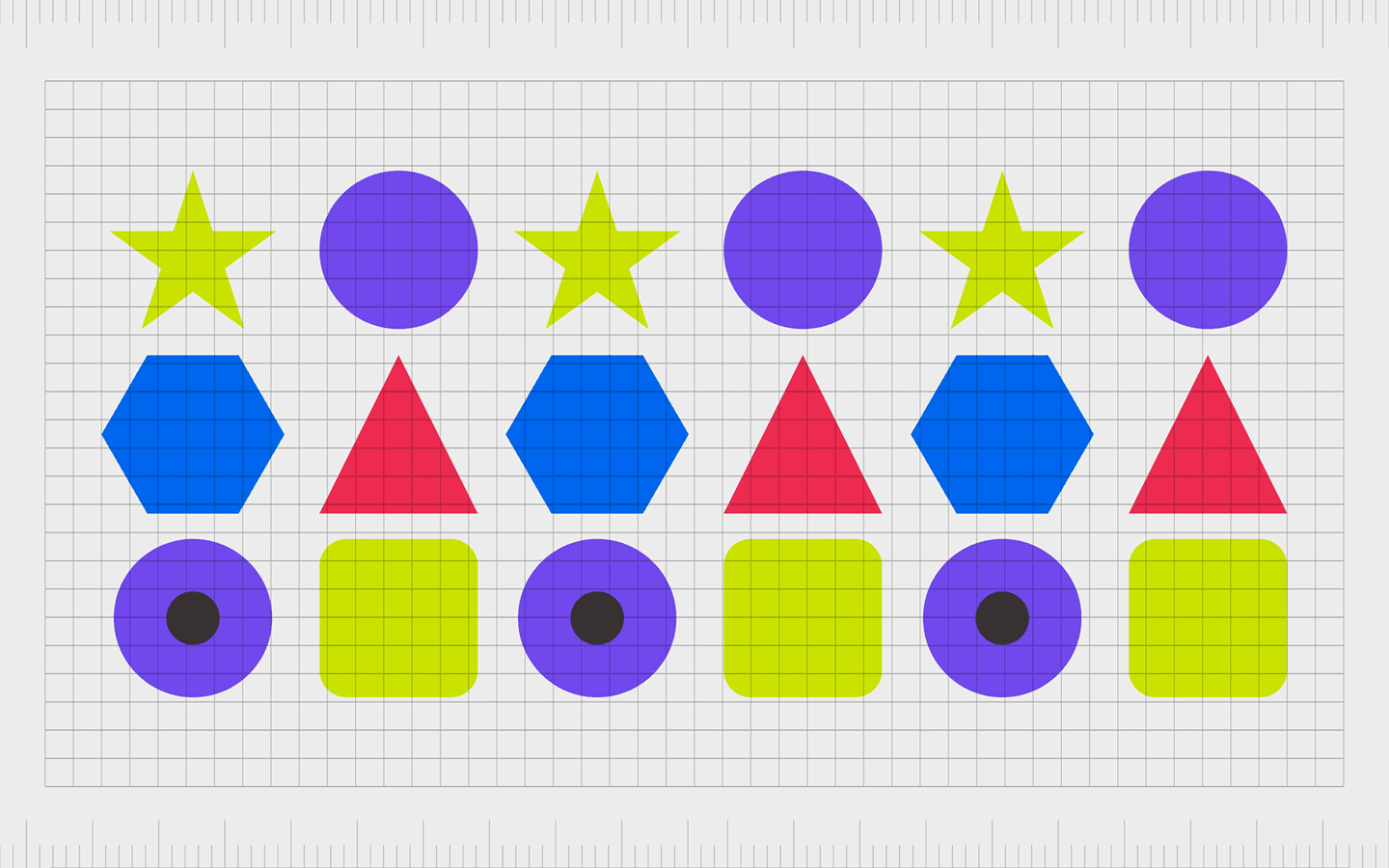
14. Simplicity – Less Is Often More
Simplicity is about cutting the clutter. Focus on what’s essential, remove distractions, and let your core message shine through. Often, a simple design has a greater impact than a crowded one.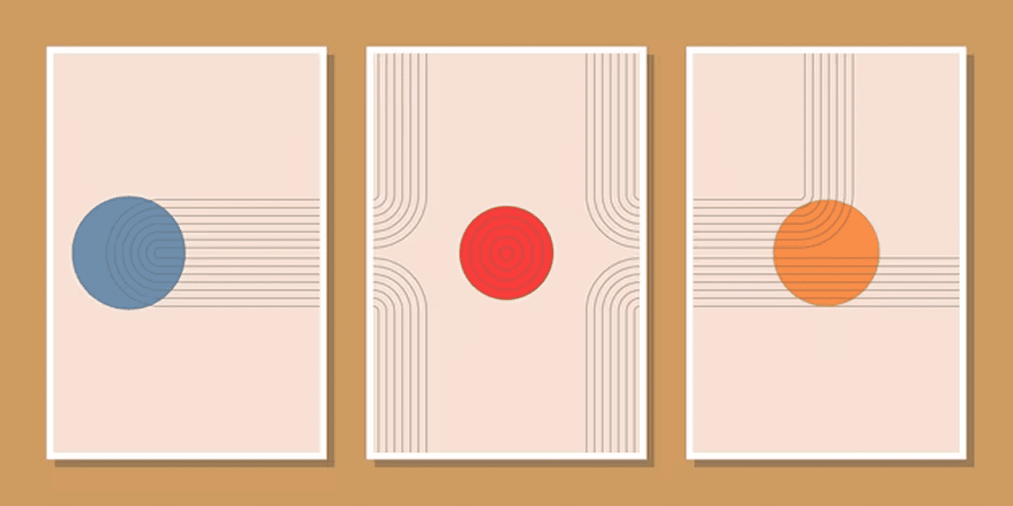
15. Emphasis – Highlighting What Matters Most
The emphasis should be goal oriented, which means highlighting a CTA, headline, of any visual element in your design. It helps viewers understand what actions to take.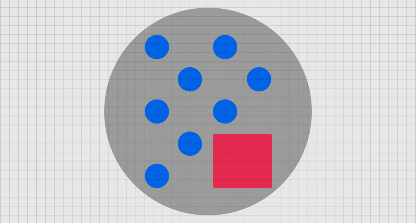
Why Do Design Principles Matter in Graphic Design?
Design is about effectively and efficiently conveying a message to the target users, not merely about making things appear beautiful. This is why graphic design concepts are so important.
As we have seen, they serve as a guide to assist in producing images that are not only aesthetically pleasing but also useful and significant. In the absence of certain guidelines, designs may appear disorganized, unclear, or even unprofessional.
We can make sure our designs engage the audience, convey a message, and accomplish their goals by comprehending and putting fundamental design principles such as balance, contrast, and hierarchy to use.
These guidelines help us stay intentional and focused when designing a logo, website, or advertisement. They assist in transforming imaginative concepts into well-executed designs that are distinctive, powerful, and above all productive.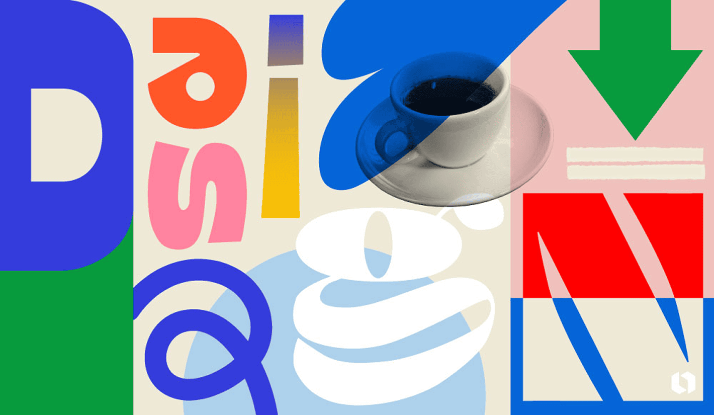
Common Mistakes Beginners Make in Graphic Design
It’s simple to get sucked into the adrenaline of colors, typefaces, and graphics when you’re first learning graphic design. However, novices frequently make typical blunders that can detract from the final product if they don’t have a firm understanding of graphic design principles.
Ignoring hierarchy is one of the worst blunders because nothing stands out when everything appears the same. Another is overcrowding designs with excessive colors or elements, which gives the impression that the design is disorganized and overbearing. Inconsistent alignment, a lack of white space, and poor typographic selections are some typical mistakes that give designs an amateurish appearance.
You may avoid these errors and produce designs that are more impactful, clearer, and cleaner by being aware of them. The good news? You may steer clear of these novice mistakes and begin producing designs that are polished, functional, and visually appealing by putting the 15 concepts we discussed into practice.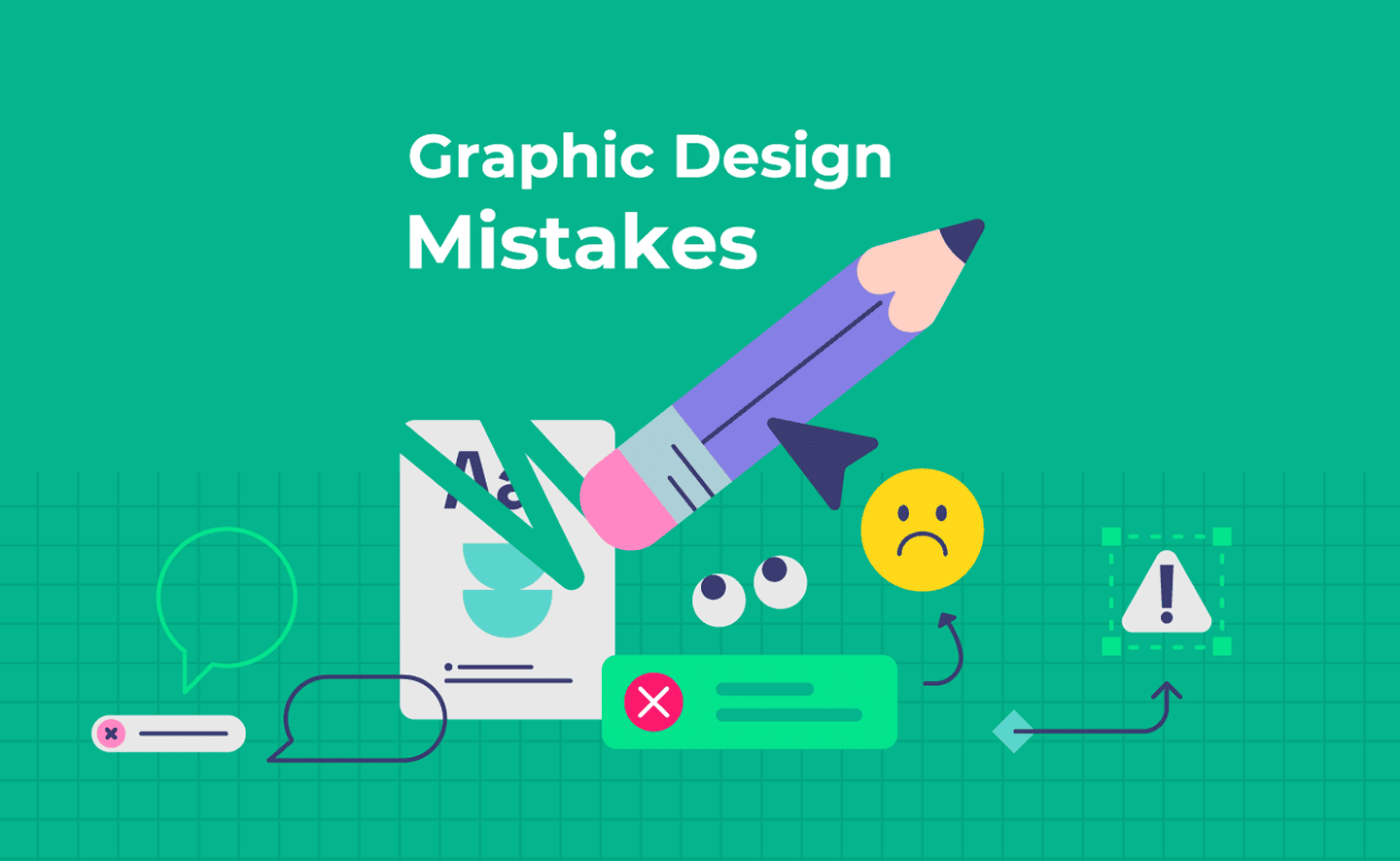
Mastering the Principle of Graphic Design
Understanding the “why” behind each design choice is more important than strictly adhering to a set of rules when it comes to mastering graphic design principles. Therefore, understanding these concepts gives us the means to produce images that not only look nice but also make sense, are easy to understand, and engage the viewer.
These guidelines serve as your compass while creating a website, social media post, or logo. They direct your decisions and assist you in avoiding typical blunders. Recall that practice is more important than perfection. You’ll gain confidence as a designer the more you put these ideas into practice.
These guidelines serve as your compass while creating a website, social media post
Therefore, after you grasp the rules, don’t be scared to break them, continue trying, and maintain your curiosity. You’re already well on your way to producing ideas that have a significant impact if you have these 15 design concepts in your toolbox. Got a project in mind? Reach out, and let’s bring your vision to life together!