Types of Typefaces – A Guide in 2025
Typefaces, a name that is not so popular but plays an important role in your business communication. When it comes to design, typefaces are referred to as the unsung heroes. They are the ones who quietly shape how people perceive your brand, products, and communication. Whether it’s a luxury brand using a sleek serif or a tech company opting for a modern sans-serif, the types of typefaces you choose say more about your brand than you might think.
If you’ve ever wondered, “Why does one font feel more premium while another feels fun and friendly?” You’re not alone. This blog is here to break down the different typefaces, their purposes, and how to choose the right one for your business.
What Is a Typeface
Before deep diving into the blog, let’s understand the definition. A typeface is a set of letters, numbers, and symbols that share a consistent design. Typefaces which are popular like Times New Roman, Helvetica and Comic Sans are few of the examples of typefaces. Within each typeface, you’ll find fonts (like bold, italic, etc.), which are specific styles or weights of that typeface.
In short, typeface is the design family, whereas a font is the style/variation within that family.
Why Typeface Matters in Business
Apart from conveying information, fonts do more than just that. They set the tone for your brand voice, impact readability, and even influence consumer trust. Here’s why typefaces should matter to you as a business:
- First Impressions: A sophisticated serif may impress high-end clientele. A quirky display font may resonate with younger audiences.
- Brand Recognition: Your font becomes part of your visual identity like Coca-Cola’s script or Google’s geometric sans-serif.
- User Experience: Clean, readable typefaces improve navigation, boost engagement, and support conversions (especially in digital products and packaging).
Therefore, it is a strategic move if you are choosing the typefaces to convey your brand messaging.
20 Main Types of Typefaces (With Examples)
Understanding the different types of typefaces helps businesses choose fonts that align with their brand tone and purpose. Here’s a breakdown of 20 key typeface categories used across design, branding, and marketing.
1. Old Style Serif
What they are: Serif fonts with curved, diagonal strokes inspired by classical calligraphy.
Common fonts: Garamond, Palatino, Goudy Old Style
Personality: Timeless, traditional, warm
Use Case: Publishing, law firms, academic institutions
Why businesses use them: They feel reliable and sophisticated, perfect for brands that want to establish long-standing trust.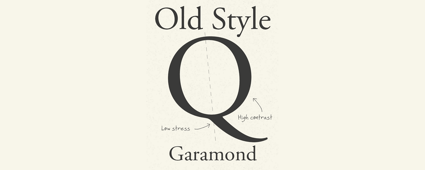
2. Transitional Serif
What they are: The bridge between old-style and modern serif fonts, with sharper contrast and cleaner forms.
Common fonts: Times New Roman, Baskerville
Personality: Elegant, balanced, professional
Use Case: Editorial websites, newspapers, professional services
Why businesses use them: They’re a safe middle ground-formal but approachable, ideal for brands with both tradition and a modern edge.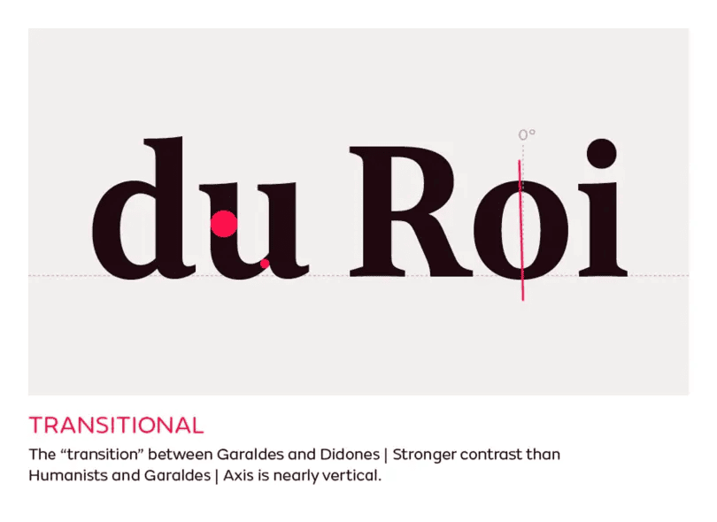
3. Modern Serif (Didone)
What they are: They are characterized by their vertical stress, minuscule hairlines, and high contrast serif fonts.
Common fonts: Bodoni, Didot
Personality: Stylish, high-end, dramatic
Use Case: Fashion magazines, luxury products, beauty brands
Why businesses use them: They make brands feel premium and visually striking often used to communicate elegance and status.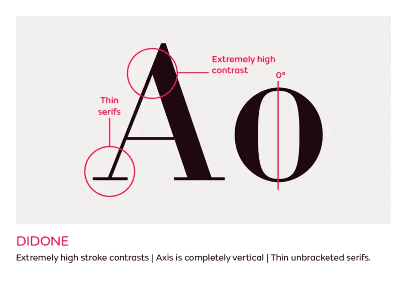
4. Slab Serif
What they are: Fonts with serifs that are thick and blocky.
Common fonts: Rockwell, Clarendon, Museo Slab
Personality: Bold, impactful, solid
Use Case: Posters, headlines, retail packaging
Why businesses use them: They demand attention and are highly legible perfect for brands that want to be loud and confident.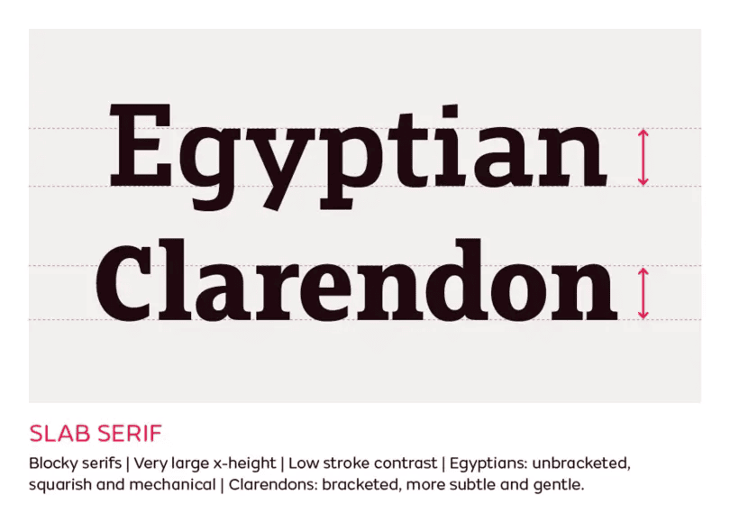
5. Grotesque Sans Serif
What they are: Early sans-serif fonts with slightly awkward but character-rich shapes.
Common fonts: Franklin Gothic, Akzidenz-Grotesk
Personality: Gritty, functional, industrial
Use Case: Print ads, traditional media, institutional design
Why businesses use them: They carry a vintage-modern look that feels authentic and grounded.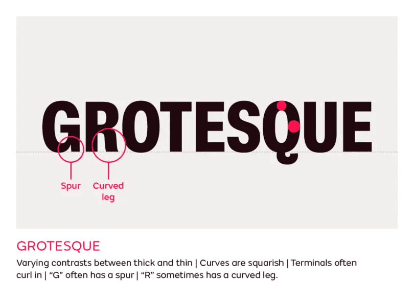
6. Neo-Grotesque Sans Serif
What they are: Clean, modern sans-serif fonts with minimal personality and high legibility.
Common fonts: Helvetica, Arial, Univers
Personality: Neutral, professional, structured
Use Case: Corporate websites, tech products, business reports
Why businesses use them: They don’t distract they just deliver. Ideal for professional, data-heavy, or tech-driven brands.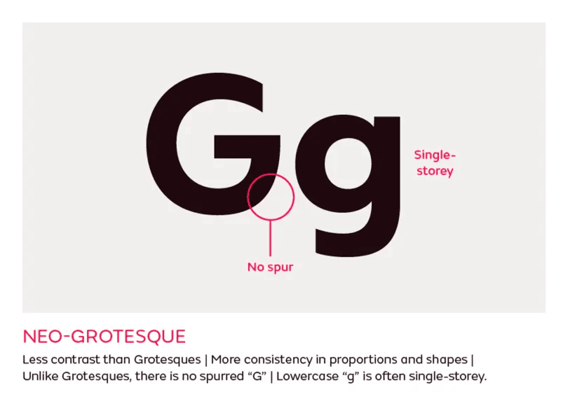
7. Humanist Sans Serif
What they are: Sans-serif fonts with calligraphic influence, offering a more organic feel.
Common fonts: Gill Sans, Calibri, Myriad
Personality: Friendly, approachable, soft
Use Case: Service businesses, wellness brands, lifestyle content
Why businesses use them: They blend readability with warmth good for brands that want to feel personal but polished.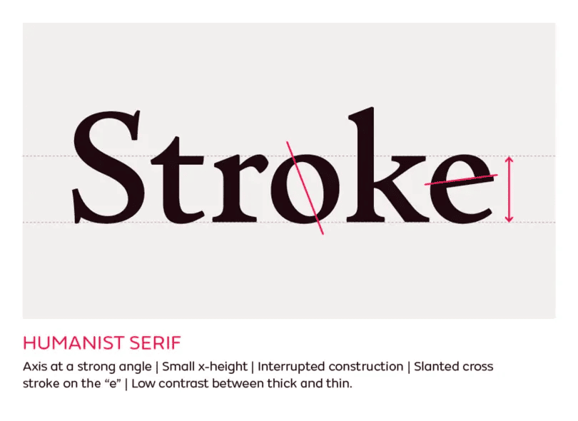
8. Geometric Sans Serif
What they are: Fonts built from precise geometric shapes like circles and squares.
Common fonts: Futura, Montserrat, Avenir
Personality: Clean, modern, futuristic
Use Case: Startups, product landing pages, minimalist branding
Why businesses use them: They give off a sharp, innovative vibe, great for modern tech companies or creative agencies.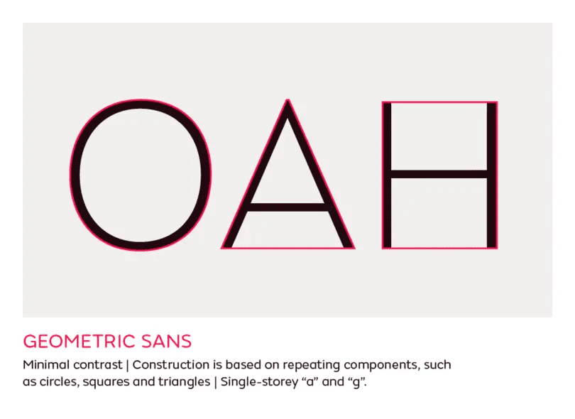
9. Script
What they are: Fonts that are meant to seem like official handwriting in cursive.
Common fonts: Pacifico, Great Vibes, Allura
Personality: Elegant, romantic, creative
Use Case: Logos, invitations, boutique brands
Why businesses use them: They add flair and emotion, making your message feel more human and artistic.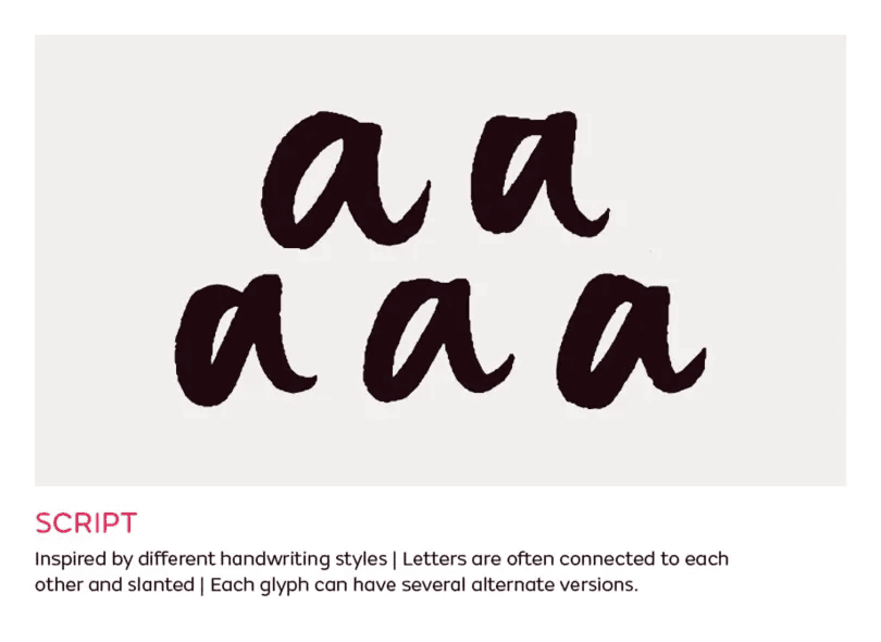
10. Handwritten
What they are: Casual, often imperfect fonts that resemble natural handwriting.
Common fonts: Amatic SC, Indie Flower, Architects Daughter
Personality: Personal, quirky, relaxed
Use Case: Kids’ products, cafés, blogs
Why businesses use them: They make your brand feel unique and authentic great for storytelling and niche audiences.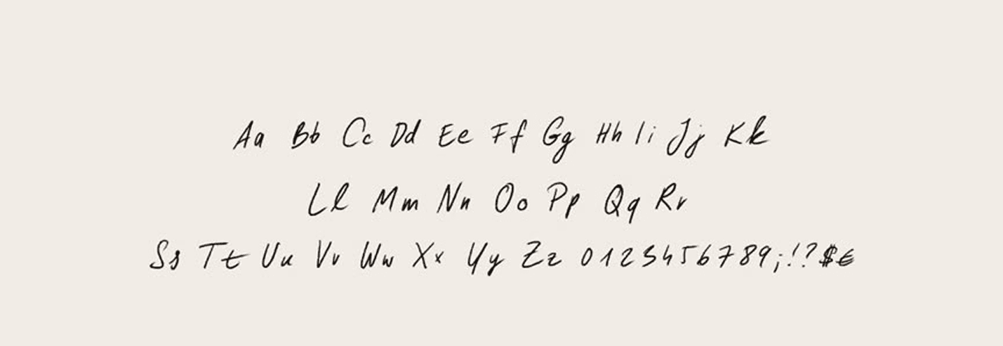
11. Calligraphic
What they are: Stylized fonts inspired by brush or pen calligraphy.
Common fonts: Zapfino, Lucida Calligraphy
Personality: Artistic, luxurious, flowing
Use Case: Event branding, jewelry, premium packaging
Why businesses use them: They add a handcrafted, refined feel often used for prestige and detail-oriented brands.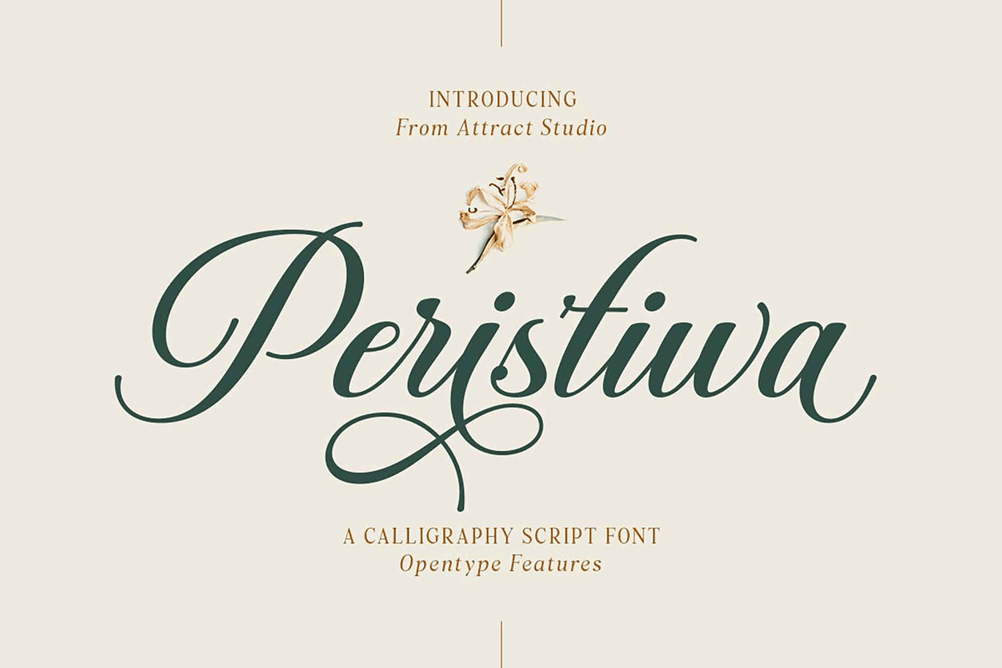
12. Blackletter (Gothic)
What they are: Medieval-inspired fonts with dense, sharp, ornamental strokes.
Common fonts: Old English Text MT, Fraktur
Personality: Historic, authoritative, traditional
Use Case: Beer labels, certificates, niche brands
Why businesses use them: They signal heritage or rebellion depending on how they’re used.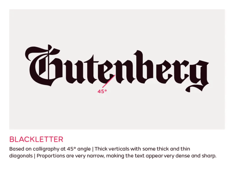
13. Display
What they are: Fonts are made for headlines and attention, not for body copy.
Common fonts: Impact, Bebas Neue, Cooper Black
Personality: Bold, expressive, loud
Use Case: Posters, magazine titles, branding
Why businesses use them: They stand out instantly a great choice when you want your message to hit hard.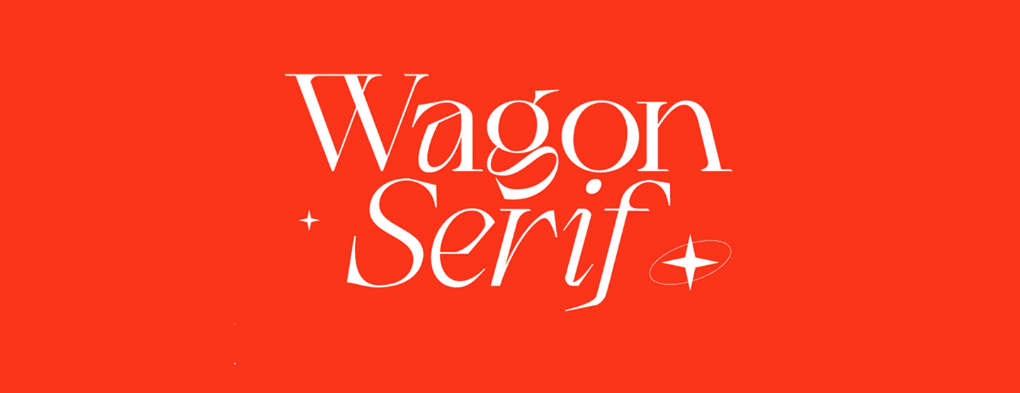
14. Decorative / Novelty
What they are: Highly styled fonts meant to fit a specific theme or mood.
Common fonts: Jokerman, Curlz MT, Lobster
Personality: Fun, unusual, niche
Use Case: Party invites, theme products, kids’ items
Why businesses use them: They’re visually memorable but best used sparingly.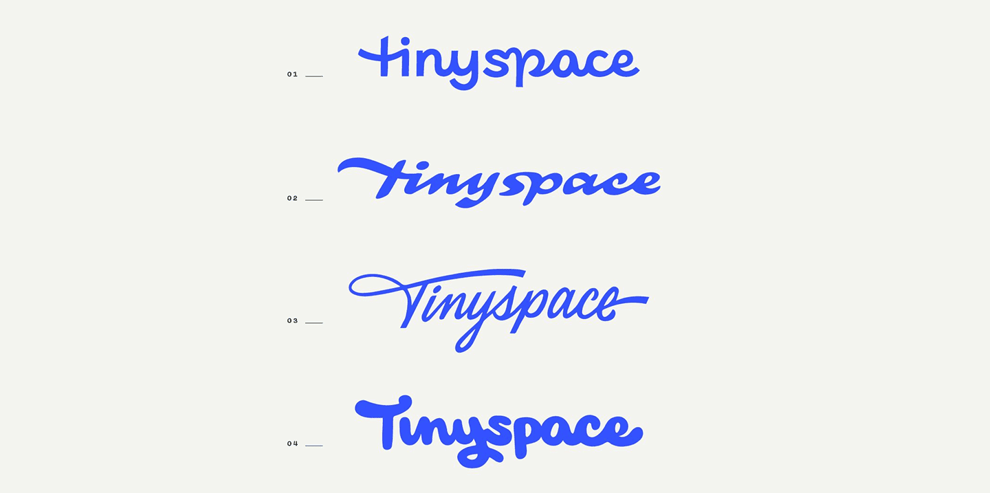
15. Monospaced
What they are: Fonts where every character takes up equal horizontal space.
Common fonts: Courier, Consolas, Source Code Pro
Personality: Technical, retro, minimalist
Use Case: Coding tools, tech brands, typewriter aesthetics
Why businesses use them: They enhance clarity in structured formats and add a clean, no-frills appearance.
16. Grunge/Distressed
What they are: Fonts with rough edges and weathered textures.
Common fonts: TrashHand, Capture It, Bleeding Cowboys
Personality: Edgy, raw, rebellious
Use Case: Music, streetwear, alternative brands
Why businesses use them: They break the mold and are perfect for brands with attitude and grit.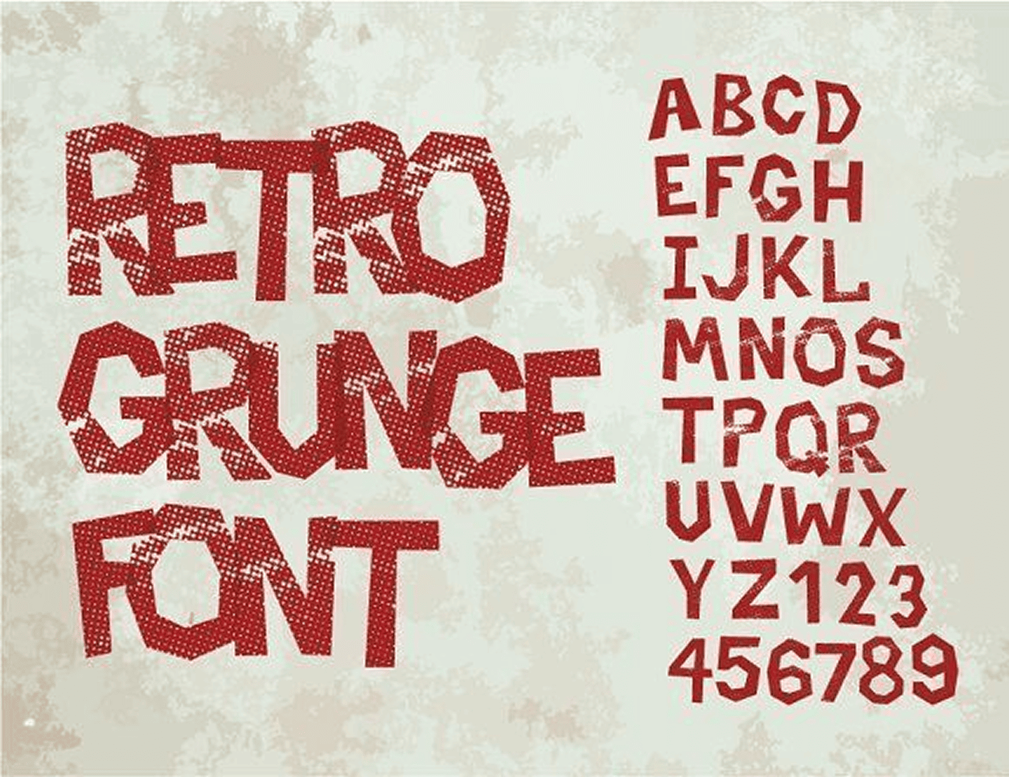
17. Stencil
What they are: Fonts designed to look like cut-outs, often mimicking spray paint stencils.
Common fonts: Stencil Std, Army Rust, Gunplay
Personality: Industrial, tough, military-like
Use Case: Tactical brands, labels, packaging
Why businesses use them: They project strength, clarity, and directness suitable for products needing a rugged tone.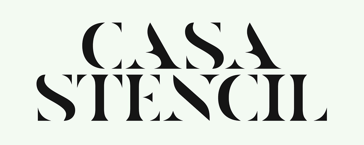
18. Outline
What they are: Fonts that show only the outer edges of letterforms.
Common fonts: Bungee Outline, Neon Tubes
Personality: Futuristic, experimental, digital
Use Case: Fashion, tech branding, digital art
Why businesses use them: They offer a stylized contrast, especially powerful when paired with bold, solid fonts.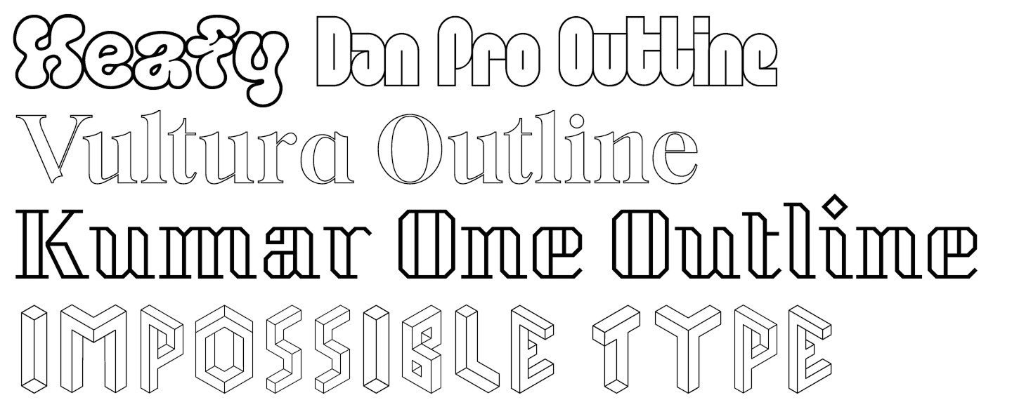
19. Pixel/Bitmap
What they are: Fonts made of visible squares, or “pixels,” mimicking early digital screens.
Common fonts: Press Start 2P, Minecraftia
Personality: Retro, digital, niche
Use Case: Gaming, NFTs, tech nostalgia
Why businesses use them: They trigger memory and emotion great for gaming and Gen Z-focused brands.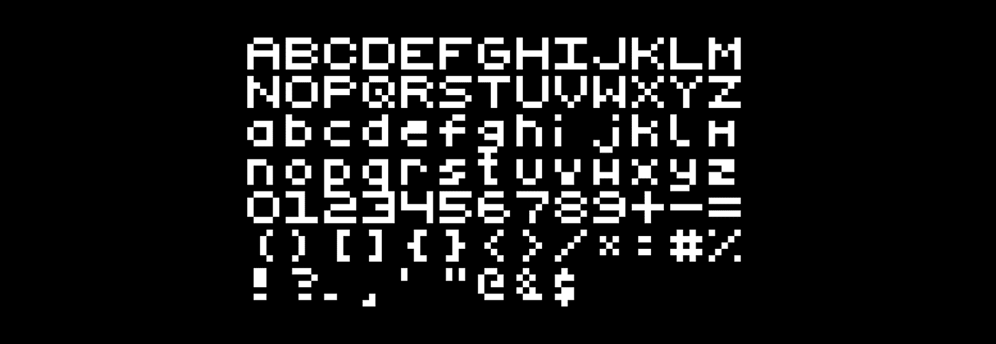
20. Variable Fonts
What they are: One font file that has the ability to dynamically change its width, weight, or style.
Common fonts: Inter, Roboto Flex, IBM Plex
Personality: Adaptive, versatile, modern
Use Case: Responsive web design, UI/UX, branding systems
Why businesses use them: They’re efficient and scalable, ideal for brands that want consistency across devices and formats.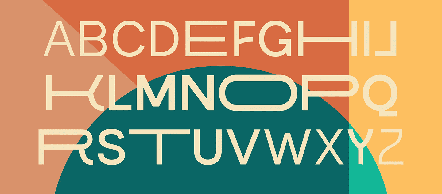
Each of these typeface categories has a personality. You might favor modern or transitional serifs if your firm practices law. If you’re launching a trendy e-commerce brand, geometric sans-serif or slab serif may feel just right. And if you’re running a quirky café or kids’ product line, a decorative or handwritten typeface might be your sweet spot.
Choosing the Right Typeface for Your Brand
Now that you understand the different typeface categories, how do you choose the one that fits your business?
Here’s a simple checklist:
| Factor | Questions to Ask |
| Brand Personality | Are you formal or friendly? Modern or traditional? |
| Target Audience | Are your customers young, professional, luxury buyers, or casual users? |
| Medium of Use | Will this be used on websites, print ads, packaging, or all of them? |
| Readability | Is the typeface easy to read on different screen sizes or in print? |
| Differentiation | Does it stand out from competitors or look too generic? |
For example, a SaaS brand might go for a geometric sans-serif (like Montserrat) for a modern, tech-driven look, while a craft chocolate company might choose a script or serif to add warmth and artistry.
How Typeface Affects Branding: Real-World Examples
- Netflix for legibility on screens and a contemporary look, Netflix utilizes a proprietary sans-serif called Netflix Sans.

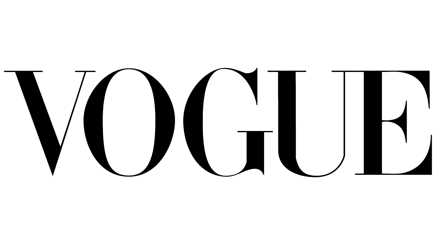
- Vogue sticks with a timeless serif to maintain its luxurious, editorial image.
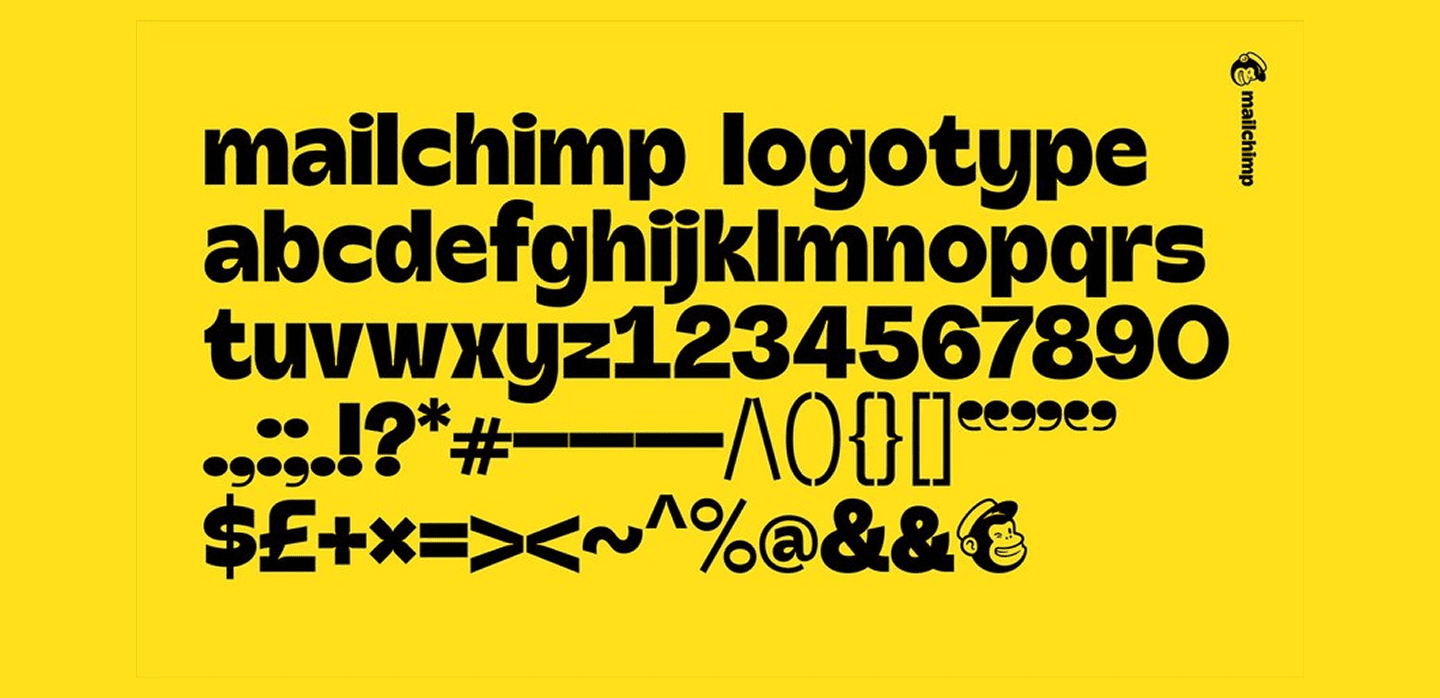
- Mailchimp blends a bold display font with quirky design elements to show off their fun brand voice.
The typeface is the tone. And the right tone builds trust.
Can You Mix Typeface Styles?
Yes but with caution. Primary and secondary typeface are provided by many businesses to provide contrast:
- Sans-serif for the body and slab serif for the headline
- Logo in a script, tagline in a sans-serif
Keeping visual harmony and proportion is the key. Overmixing fonts might appear cluttered or unprofessional.
How can we help you Convey Your Brand Message?
Typography goes beyond aesthetics as it’s a strategic asset for shaping brand identity. From serifs that build trust to sans-serifs that scream innovation, understanding the types of typefaces gives your brand a stronger visual identity.
And in a world full of choices, businesses that pay attention to details like typography are the ones that stand out. Ready to Elevate Your Brand’s Typography? At Doodlo Design Studio, we help businesses choose the right typeface that speaks their brand’s language, whether they need a logo revamp, a website redesign, or packaging that pops.